 how-to
How to Choose Wedding Flower Colours That Suit Your Day
Quick Summary
The best wedding flower colours come from the feeling you want your day to have, not from a favourite bloom. Decide whether you want calm and intimate, warm and celebratory, fresh and airy, or bold and dramatic, then choose a palette that supports that mood.
- Write down your top two feelings and check every colour choice against them.
- Pick one palette style: bold, rich, pastel or neutral, and stick with it.
- Use roughly 60 percent dominant colour, 30 percent secondary and 10 percent accent.
- Test colours in daylight, since peach blooms can look orange under warm indoor lights.
- Match substitute flowers by colour tone first, then texture, then shape.
Table of Contents
- Start With the Feeling You Want Your Day to Have
- Pick a Palette Style: Bold, Rich, Pastel or Neutral
- How to Match Wedding Flowers to Wedding Colours
- Using Your Venue, Attire and Lighting as Colour Inspiration
- Seasonal Wedding Flower Colours and Smart Substitutions
- Wedding Flower Colour Combinations That Work Well Together
- Booking Your Floral Consultation With My Botanic Life
- Frequently Asked Questions
Start With the Feeling You Want Your Day to Have
Before you look at a single swatch of wedding flower colours, decide how you want the day to feel. A soft, romantic wedding and a bold, bright celebration call for very different flowers.
Ask yourself three simple questions. How do you want guests to feel when they walk in? What mood should the photos carry? Which words describe your relationship best?
Here is a quick way to start:
- Calm and intimate: Think blush, ivory, sage and dusty blue.
- Warm and celebratory: Think terracotta, apricot, gold and deep red.
- Fresh and airy: Think white, pale lavender and soft green.
- Bold and dramatic: Think jewel tones, plum, emerald and bright coral.
Write down your top two feelings. Keep them handy, because every colour decision from here on should support them. If a flower looks lovely but fights your chosen mood, it probably doesn't belong in your bouquet.
Pick a Palette Style: Bold, Rich, Pastel or Neutral
Once you know the feeling, choose a palette style. Each style shapes the whole look of the day, from bouquets to table settings.
Bold palettes use saturated colours that stand out. They suit modern venues and couples who want energy.
Rich palettes combine deep, warm tones such as burgundy, plum and gold.
Pastel palettes use soft, light shades like blush, lilac and baby blue.
Neutral palettes lean on white, cream, ivory and soft greens.
A common mistake is mixing styles without a plan. A bold coral bouquet next to pale pastel centrepieces can look like two different weddings.
How to Match Wedding Flowers to Wedding Colours
This is where your palette becomes real flowers. For guidance on bridal bouquets specifically, see our guide to wedding bouquets in Melbourne. Matching blooms to colours is a skill, and it gets easier with a clear process rather than a mood board.
Follow these steps in order:
- Pick a dominant colour. This should cover about 60 percent of your floral design.
- Choose a secondary colour. Use it for about 30 percent of the arrangements.
- Add an accent. This small pop, around 10 percent, adds interest.
- Check the flower's natural range. Roses, for example, come in many shades. Ask for the exact tone you want, not just the colour name.
- Test in daylight. A peach bloom can look orange under warm indoor lights.
Remember that many flowers do not come in every colour. Blue roses, for instance, are dyed rather than naturally blue. If you love a particular shade, ask your florist which flowers hold that colour well, and at which time of year.
For a practical reference, here is how common flower types typically fit into palette roles:
| Palette Role | Common Flowers | Best For |
|---|---|---|
| Dominant | Garden roses, ranunculus, peonies | Bridal bouquets |
| Secondary | Spray roses, stock, lisianthus | Centrepieces, bridesmaid posies |
| Accent | Billy buttons, scabiosa, Craspedia | Boutonnieres, small details |
| Greenery | Eucalyptus, ruscus, olive leaves | Structure and texture |
A colour-to-flower workflow you can actually follow
Most couples get stuck because they start with a bloom they love and then try to force it into a palette. Reverse the order.
Step 1: Name the exact tone, not the colour family. "Pink" is not a brief. "Dusty rose with a grey undertone" is.
Step 3: Match texture to the role. Dominant flowers usually need volume and softness, so rounded, full blooms work well.
Step 4: Build a substitution shortlist before you commit. For every key bloom, ask your florist for two alternatives in the same colour family but a different texture or shape. This is what keeps a palette intact when a grower runs short.
Step 5: Review the whole set together. Colours that look harmonious on a screen can clash when real petals sit next to each other.
What tends to go wrong
Watch out: Some dominant flowers hold their colour for only a short window, so the palette you approve at consultation may not be the palette guests see on the day.
Another frequent issue is relying on a single bloom for a signature colour. If that stem is unavailable, the whole palette collapses.
Finally, be careful with dyed and tinted flowers. They can deliver an exact shade, but dye uptake varies between stems, and some tinted blooms release colour onto fabrics and table linen.
Your florist can adjust these choices based on what is available and in season.
Palette share of floral design
Using Your Venue, Attire and Lighting as Colour Inspiration
Your surroundings should shape your colours. The venue, your outfits and the light at your ceremony all affect how colours look.
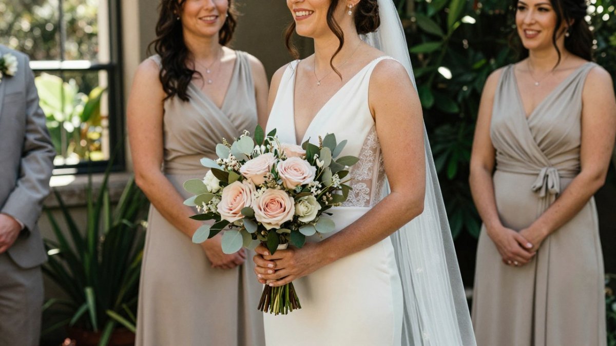
Start with the venue. A rustic barn with timber walls suits warm tones like apricot and cream. A white modern space can carry bolder hues without clashing.
Next, consider attire. Your dress sets the base tone. Ivory and champagne gowns pair well with blush and sage. Bright white gowns suit crisp whites and clear pastels.
Lighting matters more than most couples expect. Colours shift under different light:
- Golden hour light warms everything, so pinks look peachy and whites look cream.
- Overcast light softens colours and can make bold shades look muted.
- Indoor evening light often turns pale blues grey and reds darker.
Ask your florist to see your venue in the time of day you plan to marry. Bring photos of the space taken at the same hour.
Seasonal Wedding Flower Colours and Smart Substitutions
Season affects both colour and cost. Flowers that bloom locally in spring may be scarce in winter, and imported blooms can be expensive any time of year.
In spring, look for soft pinks, lilac, and clear whites. Ranunculus, tulips and sweet peas are common choices. Summer favours bright, sunny tones like yellow, coral and fuchsia, along with dahlias and zinnias. Autumn brings warm shades such as burgundy, rust and mustard. Winter works well with deep reds, ivory and evergreen textures.
How to keep a palette intact when a bloom is unavailable
Substitution is not about finding a lookalike flower. It is about matching three properties in order of importance: colour tone, texture, and shape. If you match all three, guests will not notice the swap. If you match only the colour, the arrangement can look thinner or flatter than planned.
Use this sequence when your first-choice bloom is out of season or short:
- Match the tone first. Stay within the same undertone, warm blush versus cool blush, for example, because undertone is what the eye reads as "the same colour".
- Match the texture second. Replace a soft, ruffled bloom with another soft, ruffled bloom rather than a smooth, waxy one. Texture carries the romantic or modern feel of the design.
- Match the shape last. If the original flower was a rounded focal bloom, choose another rounded focal bloom. If it was a spike, keep a spike.
- Adjust the quantity. A smaller, more expensive bloom may need fewer stems to fill the same visual space, while a larger bloom may need fewer still. Ask your florist to rebalance stem counts rather than simply swapping one for one.
Worked examples of the logic:
- Swap peonies for garden roses in a similar blush tone when peonies are out of season, both are rounded, full and soft.
- Replace out-of-season sweet peas with spray roses or freesia, both add airy movement and a similar scale.
- Use Craspedia for a golden accent when sunflowers are unavailable, both are rounded and read strongly at a distance.
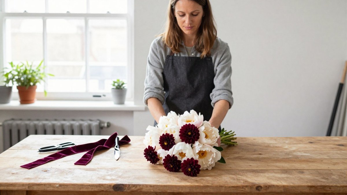
- If a deep burgundy dahlia is unavailable, a burgundy ranunculus or a dark calla can hold the same tone with a different texture, depending on whether you want softness or structure.
Availability, budget and where to spend
Availability and price move together. A bloom in peak local season is usually the most affordable way to hold a colour, while the same colour out of season often means imports, smaller stems or a higher price per stem.
A budget-aware approach is to decide where colour matters most and concentrate the expensive, exact-tone blooms there:
- Bridal bouquet and immediate family posies: highest visibility in photos, so this is where exact tone is worth protecting.
- Ceremony focal point: the arch, arbour or entry arrangement that guests see first.
- Reception tables: the largest stem count, so this is where flexible, in-season blooms and greenery do the most work.
- Small details: boutonnieres, corsages and cake flowers can use accents and offcuts without affecting the overall palette.
Watch out: Insisting on one exact bloom for every arrangement is the most common way a floral budget breaks.
Be honest with your florist about flexibility. Some couples insist on one exact bloom, while others care only about the colour. Knowing which matters to you can save time and money.
Wedding Flower Colour Combinations That Work Well Together
Some colour pairings are reliable crowd-pleasers. Use these as starting points, then adjust to your own taste.
- Blush and sage: Soft, romantic and easy to photograph. Works in almost any season.
- Ivory, champagne and gold: Elegant and timeless, especially for evening events.
- Dusty blue and white: Calm and coastal, a good choice for seaside or summer weddings.
- Coral and cream: Warm and joyful, ideal for garden and outdoor celebrations.
- Burgundy and blush: Rich but still soft, suited to autumn and winter.
Complementary colours sit opposite each other on the colour wheel. Pairing them creates energy, such as orange with blue or purple with yellow. Analogous colours sit next to each other, such as pink with lilac, and produce a calmer, more harmonious look.
Balance is the key. If your palette is bright, add white or greenery to give the eye a place to rest. If it is muted, one bold accent can lift the whole design.
Booking Your Floral Consultation With My Botanic Life
Once you have a feeling, a palette style and a few colour pairings in mind, you are ready to talk to a florist. At My Botanic Life, creative director Nicole works with couples to turn these early ideas into a clear floral plan, whether the wedding is local or a destination event.
Come to the consultation with your top two feelings, a few photos of colours you love, and details about your venue and attire. Nicole's background in horticulture, aromatherapy and floristry informs the floral advice she offers.
If you are ready to take the next step, get in touch with My Botanic Life to request a consultation. You can also read what to expect at a floral consultation before you book. Browsing real weddings with bespoke florals may help you visualise your palette, and how we turned venue colours into flower inspiration shows the process in a real setting.
Last Updated: November 8, 2026
Frequently Asked Questions
How do I choose colours for my wedding flowers?
Start with the mood you want, then narrow to a palette of two or three main colours plus one accent. Look at your venue, your attire and the season, and test options against each other in natural light. Pricing and flower availability depend on quantity, date and delivery, so ask My Botanic Life for a quote once your palette is clear.
Should wedding flowers match the wedding colour scheme?
They do not need to match exactly. Many couples choose flowers that sit within the scheme, using a deeper or lighter shade of a theme colour, or a complementary tone. This keeps the arrangements cohesive while allowing natural variation in blooms, which is part of their charm.
How many colours should be in a wedding flower palette?
Most palettes work best with two or three main colours and one accent. Fewer colours give a calm, unified look, while more can feel busy unless they share a tone family. Neutral greens and whites are useful connectors that let the main colours stand out without crowding the arrangements.
Do wedding flowers need to match the season?
Matching the season is practical as well as aesthetic, because in-season flowers are usually fresher and more available. If you want a colour that is out of season, a florist can often suggest a similar shade in a flower that is available on your date. Discuss this early so the palette can adapt.